Elon Musk: The Second Boring Machine is Almost Ready
IN BRIEF
For months, The Boring Company has been digging underground tunnels to facilitate tests of Elon Musk’s hyperloop system. Now, the company is preparing to introduce a brand new invention — a second boring machine.
Elon Musk has announced via Twitter that The Boring Company’s newest invention for tunnel excavation is “almost ready.” This, the second boring machine, will be dubbed Line-Storm, a moniker inspired by the poem “A Line-Storm Song” by Robert Frost.
Musk went on to respond to a Twitter user that asked whether The Boring Companywas a real enterprise. The SpaceX and Tesla CEO confirmed that it was, and stated that a physical tunnel is being created and is growing longer every day.
The tunnel being excavated by The Boring Company is a test site for hyperloop technology. Musk has already shared images demonstrating that the underground tract is large enough for a car to pass through.
Digging tunnels via conventional means would be a big obstacle for the introduction of underground hyperloop infrastructure. Musk is confident that — with help from their new machines — The Boring Company can perform the work relatively cheaply and efficiently. It remains to be seen what kind of advantages Line-Storm offers over its predecessor, the “Godot.”
Musk has previously stated that he’s received permission from a federal official to continue to expand his hyperloop project. With a working car elevator and this new tunneling machine, it seems like all the pieces for his vision for the future of transport are falling into place.
Hands On: LookUp 4.0 for the iPhone and iPad can make browsing a dictionary a pleasure
An updated design makes Lookout fast to use on your iPhone or your iPad, and it even has an Apple Watch implementation —but it is not the dictionary app for everyone.
You either look up a dictionary because you need to quickly check what something means or because you just relish definitions and the history of words. Newly updated LookUp 4.0 aims to satisfy both uses with a redesign that concentrates on speed and gorgeous presentation. Alongside photos or line artwork that every word definition displays, the app now names and defines anything you point your camera at.
While this camera feature is the standout new additions, the most significant in the longer term is version 4.0’s adoption of iOS 11’s drag and drop on the iPad.
Now when you’re reading or writing a document and you’re not sure about a word, you can drag it straight out of the word processor and into LookUp. Drop the word anywhere on LookUp’s window and it will search for its definition.
Or say you’re writing anything that extensively quotes from a dictionary, such as an academic article or a Dan Brown novel. Find the definition in LookUp, then drag it out to your word processor document.
Whether you find definitions by dropping words onto the app or just typing it into the search box the old-fashioned way, those definitions look superb. The app now has a very Apple Music-like layout of font and color which is clear and striking.
There are very few controls to get in the way of your reading the definition. LookUp offers only a few tools such as the options to mark a word as a favorite and to change the app from light to dark background on a schedule or automatically.
The tool you tend to use the most, though, is the pronunciation button: tap that and a very short audio clip plays so that you learn how to say the word.
Whatever the word is, you do also get a photo or a graphic illustrating it. Photographs are more helpful in that they show you what something looks like but the artwork is more appealing because it’s so very well done.
It’s an art deco style of illustration, all done by the app’s creator, and for what it adds to the design, this is a key reason to enjoy using this dictionary.
There is also an Apple Watch app where you can dictate the word you’re looking for – which could be handy when you’re not sure of the spelling.
Dictating some words into the Apple Watch app, dragging others into the iPad version and simply typing into the iPhone one: this is how you will use LookUp every day. The first day you use it, though, you’ll be trying out its Look Around to Search feature.
It’s for defining objects in front of you when you haven’t a clue what to search for. Picture husbands in supermarkets trying to work out what’s a cucumber and what’s a courgette. LookUp 4.0 uses Apple’s new LookAround tool which provides the developers of apps with image analysis.
LookUp’s implementation of this is slightly cumbersome to get started: you need to tap into the Search box as if you’re going to type a word. Once you’ve opened that Search box, though, you get a button to switch on this feature. Tap that and the app shows you whatever your camera is currently looking at.
Turn your phone’s camera toward some object and LookUp will over lay the image with the word that describes that item. It’s a single word and if you’re pointing at a lot of objects then it’s the one that the app decides is the most prominent in the frame.
Tap on the word displayed and you’re looking it up in the dictionary. So you just see the object, tap the word, get the definition.
However, while the makers claim an accuracy of around 70 percent you’re going to need 100 percent luck for it be useful. That’s in part because it depends so much on how clear the object is, what angle you’re looking at it and what else is in the background.
Ultimately, as fun as it is to try, it’s not a practical use for a dictionary yet. You can’t know that it got courgette’ wrong unless you already know that you’re really looking at a cucumber. You need to know what the right word is before you can know that the dictionary has got the right word.
That said, LookUp is about more than a straightforward definition. It does tell you more and it contains extra information such as text from relevant Wikipedia articles.
However, it can do this because LookUp is not a dictionary per se: it is really a viewer for Wiktionary, the Wikipedia-like dictionary. There are no word definitions actually within the LookUp app, they are all looked up for you on Wiktionary. Consequently the app dependent on that website and this can bring a range of small problems.
Clearly the biggest by far was when we spotted a definition that should’ve used a colon and instead had a semi-colon. Look, if you’re into dictionary apps, you know this matters.
What you definitely need to know is that an internet connection matters too: without one, LookUp won’t show you anything. With one, it will show you what Wiktionary says – including any errors. Sometimes those errors are odd choices by the makers of Wiktionary that mean it’s the lesser-known and lesser-needed definitions of a word that get sent to LookUp first.
That’s not LookUp’s error but it is something that reduces its worth. What it can be is a reason to just go directly to wiktionary.com on your browser.
Go to the Wiktionary website once, though, and you’ll see why LookUp is worth getting —Wiktionary is not pretty. More than that, it’s ugly enough that it takes you time to find the definition you want.
If you’re the sort who sees dictionaries as something to wallow in rather than just checking you’re not using the wrong word, then TerminologyTerminology from Agile Tortoise is a better option. That has a full US English dictionary built in and is replete with links to definitions and etymology via the Oxford English Dictionary and others.
For a concise and gorgeous dictionary that you use to glance at definitions, however, LookUp 4.0 is very appealing. It costs $2.99 on the App Store.
Google’s plan to revolutionise cities is a takeover in all but name
Google’s self-driving cars are part of the company’s concept for cities more responsive to people’s needs. Photograph: KeystoneUSA-ZUM/REX Shutterstock
Last June Volume, a leading magazine on architecture and design, published an article on the GoogleUrbanism project. Conceived at a renowned design institute in Moscow, the project charts a plausible urban future based on cities acting as important sites for “data extractivism” – the conversion of data harvested from individuals into artificial intelligence technologies, allowing companies such as Alphabet, Google’s parent company, to act as providers of sophisticated and comprehensive services. The cities themselves, the project insisted, would get a share of revenue from the data.
Cities surely wouldn’t mind but what about Alphabet? The company does take cities seriously. Its executives have floated the idea of taking some struggling city – Detroit? – and reinventing it around Alphabet services, with no annoying regulations blocking this march of progress.
All of this might have looked counter-intuitive several decades ago, but today, when institutions such as the World Bank preach the virtues of privately run cities and bigwigs in Silicon Valley aspire to build sea-based micronations liberated from conventional bureaucracy, it does not seem so far-fetched.
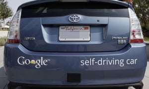
Alphabet already operates many urban services: city maps, real-time traffic information, free wifi (in New York), self-driving cars. In 2015 it launched a dedicated city unit, Sidewalk Labs, run by Daniel Doctoroff, former deputy mayor of New York and a veteran of Wall Street.
Doctoroff’s background hints at what the actual Google Urbanism – as opposed to its theoretical formulations – portends: using Alphabet’s data prowess to build profitable alliances with other powerful forces behind contemporary cities, from property developers to institutional investors.
On this view, Google Urbanism is anything but revolutionary. Yes, it thrives on data and sensors, but they only play a secondary role in determining what gets built, why, and at what cost. One might as well call it Blackstone Urbanism – in homage to one of the largest financial players in the property market.
Since Toronto has recently chosen Alphabet to turn Quayside, a 12-acre undeveloped waterfront area, into a digital marvel, it wouldn’t take long to discover whether Google Urbanism will transcend or accommodate the predominantly financial forces shaping our cities.
Sidewalk Labs has committed $50m to the project – mostly for hosting a year-long consultation after which either party can exit. Its 220-page winning bid provides fascinating insights into its thinking and methodology. “High housing costs, commute times, social inequality, climate change and even cold weather keeping people indoors” – such is the battlefield Doctoroff described in a recent interview.
Alphabet’s weapons are impressive. Cheap, modular buildings to be assembled quickly; sensors monitoring air quality and building conditions; adaptive traffic lights prioritising pedestrians and cyclists; parking systems directing cars to available slots. Not to mention delivery robots, advanced energy grids, automated waste sorting, and, of course, ubiquitous self-driving cars.
Alphabet essentially wants to be the default platform for other municipal services. Cities, it says, have always been platforms; now they are simply going digital. “The world’s great cities are all hubs of growth and innovation because they leveraged platforms put in place by visionary leaders,” states the proposal. “Rome had aqueducts, London the Underground, Manhattan the street grid.”
Toronto has already given Alphabet the job of developing part of its quayside. Photograph: Ikonica/Getty Images/Radius Images
Toronto, led by its own visionary leaders, will have Alphabet. Amid all this platformaphoria, one could easily forget that the street grid is not typically the property of a private entity, capable of excluding some and indulging others. Would we want Trump Inc to own it? Probably not. So why hurry to give its digital equivalent to Alphabet?
Who determines the rules by which different companies get access to it? Would cities be saving energy using Alphabet’s own AI systems or would the platform be open to others? Would its self-driving cars be those of Waymo, Alphabet’s dedicated unit, or those of Uber and any other entity that builds them? Would Alphabet support “urban net neutrality” as actively as it supports net neutrality of the conventional type?
In reality, there is no “digital grid”: there are just individual Alphabet products. Its bet is to furnish cool digital services to establish complete monopoly over data extractivism within a city. What passes for the efforts to build the “digital grid” might, in fact, be an attempt to privatise municipal services – a staple feature of Blackstone Urbanism, not a radical departure from it.
Alphabet’s long-term goal is to remove barriers to the accumulation and circulation of capital in urban settings – mostly by replacing formal rules and restrictions with softer, feedback-based floating targets. It claims that in the past “prescriptive measures were necessary to protect human health, ensure safe buildings, and manage negative externalities”. Today, however, everything has changed and “cities can achieve those same goals without the inefficiency that comes with inflexible zoning and static building codes”.
This is a remarkable statement. Even neoliberal luminaries such as Friedrich Hayek and Wilhelm Röpke allowed for some non-market forms of social organisation in the urban domain. They saw planning – as opposed to market signals – as a practical necessity imposed by the physical limitations of urban spaces: there was no other cheap way of operating infrastructure, building streets, avoiding congestion.
For Alphabet, these constraints are no more: ubiquitous and continuous data flows can finally replace government rules with market signals. Now, everything is permitted – unless somebody complains. The original spirit behind Uber was quite similar: away with the rules, tests and standards, let the sovereign consumer rank the drivers and low-scoring ones will soon disappear on their own. Why not do this to landlords? After all, if you are lucky to survive a house fire, you can always exercise your consumer sovereignty and rank them down. Here the operating logic is that of Blackstone Urbanism, even if the techniques themselves are part of Google Urbanism.
Google Urbanism means the end of politics, as it assumes the impossibility of wider systemic transformations, such as limits on capital mobility and foreign ownership of land and housing. Instead it wants to mobilise the power of technology to help residents “adjust” to seemingly immutable global trends such as rising inequality and constantly rising housing costs (Alphabet wants us to believe that they are driven by costs of production, not by the seemingly endless supply of cheap credit).
Normally these trends mean that for most of us things will get worse. Alphabet’s pitch, though, is that new technologies can help us survive, if not prosper, by using self-tracking to magically find time in the busy schedules of overworked parents; by making car debt obsolete as car ownership becomes unnecessary; by deploying artificial intelligence to lower energy costs.
Google Urbanism shares the key assumption of Blackstone Urbanism: our highly financialised economy – marked by stagnating real wages, liberalised housing markets that drive up prices due to persistently strong global demand, infrastructure built on an opaque but highly lucrative public-private partnership model – is here to stay. The supposedly good news is that Alphabet has the sensors, networks and algorithms to restore and maintain our earlier standard of living.
The Toronto proposal is still vague on who will pay for this urban utopia. It acknowledges that “some of [the project’s] most impactful innovations are major capital projects that will require large volumes of reliable offtake to be financeable”. Short of that, it might become the urban equivalent of Tesla: a venture propelled by infinite public subsidies that derive from collective hallucination.
Alphabet’s appeal to investors lies in the modularity and plasticity of its spaces; there is no function permanently assigned to any of their parts. Much like in the early cybernetic utopias of eternally flexible and reconfigurable architecture, there is no function permanently assigned to any of its parts. Everything can be reshuffled and rearranged, with boutiques turning into galleries only to end up as gastropubs – as long as such digitally enabled metamorphosis yields a higher return.
After all, Alphabet is building a city “where buildings have no static use”. For example, the centrepiece of the proposed neighbourhood in Toronto – the Loft – will offer a skeleton structure that “will remain flexible over the course of its lifecycle, accommodating a radical mix of uses (such as residential, retail, making, office, hospitality and parking) that can respond quickly to market demand”.
Here lies the populist promise of Google Urbanism: Alphabet can democratise space by customising it through data flows and cheap, prefabricated materials. The problem is that Alphabet’s democratisation of function will not be matched by the democratisation of control and ownership of urban resources. That’s why the main “input” into Alphabet’s algorithmic democracy is “market demand” rather than communal decision-making.
Instead of democratising ownership and control, Alphabet promises participation, consultation and new ways to track the vox populi – measured automatically via Alphabet’s extensive sensory network. The company even hails Jane Jacobs, everyone’s favourite urbanist, lending some credibility to the thesis that the kind of small-scale, highly flexible urbanism preached by Jacobs is quite compatible with Wall Street’s growing interest in real estate and infrastructure.
In many cities, market demand is precisely what leads to the privatisation of public space. Decisions are no longer taken in the political realm but are delegated to asset managers, private equity groups, and investment banks that flock to real estate and infrastructure searching for stable and decent returns. Google Urbanism would not reverse this trend, it would accelerate it.
The utopian, almost anarchist dimensions of Google Urbanism would be something to celebrate if most residents were in charge of their own spaces, buildings and infrastructures. Since this is not the case and such spaces are increasingly owned by private (and often foreign) investors, a radical departure from the highly bureaucratic, stifling and capital-constraining system of zoning laws or building regulations is likely to give us the paralysing horror of the Grenfell Tower rather than the reassuring uproar of a Vermont townhall.
Aside from the institutional investors shopping for entire city blocks, Alphabet understands the real audience for its cities: the global rich. For them, the narratives of data-driven sustainability and algorithmically produced artisanal lifestyles – Sidewalk Labs even promises “a next-gen bazaar” replenished by local communities of makers – are just another way to justify rising values of their property portfolios.
That Alphabet’s “urbanism as a service” might not appeal to the residents of Toronto does not matter. As a real estate project, its chief goal is to impress its future missing residents –above all, millions of Chinese millionaires flocking to Canada’s housing markets. Doctoroff was not equivocating when he told theGlobe and Mail that Alphabet’s Canadian venture “primarily is a real-estate play”.
Alphabet’s urban turn also has a broader political significance. The courting of Alphabet by Canada’s politicians along with the bidding war that has erupted over Amazon’s second North American headquarters – some cities have offered it incentives to the tune of $7bn to relocate there – suggest that, despite the growing backlash against Silicon Valley, our political classes have few other positive (and, as importantly, cash-positive) industries to draw upon.
This is clearly the case with Canada’s prime minister, Justin Trudeau, who has recently pitched his country as “a “Silicon Valley, plus everything else Canada is”. In one respect, he is certainly right: it has been Canada’s pension funds that turned real estate and infrastructure into the lucrative alternative assets they are today.
Let us not have any illusions about Google Urbanism. One has to be naive to believe that the emerging urban alliance of the technology and financial industries would produce results detrimental to the latter. Blackstone Urbanism will still be shaping our cities even if Alphabet takes over their garbage disposal. “Google Urbanism” is a nice way of camouflage this truth.
However, it doesn’t end there, because Google Maps has now been enhanced to provide a more useful feature. Indeed, the famous Google Maps is not only dependable in giving driving directions on the planet, but it also allows you to go to space.
Exploring a number of planets, satellites, and the International Space Station is now possible via the revamped Google Maps feature. This has been made possible via the imagery captured by the Cassini spacecraft. This space vehicle was launched into space some 20 years ago in order to explore the solar system. Thus, it was able to send back great amounts of information and priceless images of Saturn and its numerous moons.
You can now navigate the craters of the moon or even the lakes of Titan, Saturn’s largest moon, which are composed of methane. Moreover, Earth looks even more gorgeous from the International Space Station.
In addition, you can enjoy viewing the planets and moons as they rotate in 3D view. So, you can see where the sun hits on which surface and which areas are on the dark side.
Although you won’t be able to search for locations in space, you can still zoom into the moons and planets, in which you can learn about various locations. Mars also is a great place to venture, as you can click on various regions in order to learn more about certain features of the planet and how each one got their names.
So, even at the comfort of your own couch, you can now enjoy viewing the universe, thanks to the massive pictures from NASA. More than 500,000 images taken by the famed spacecraft from NASA were used to reconstruct the heavenly bodies in the solar system. Just zoom out of Earth until you reach space from your Google Maps app.
A sneak peak at radical future user interfaces for phones, computers, and VR
October 20, 2017
Grabity: a wearable haptic interface for simulating weight and grasping in VR (credit: UIST 2017)
Drawing in air, touchless control of virtual objects, and a modular mobile phone with snap-in sections (for lending to friends, family members, or even strangers) are among the innovative user-interface concepts to be introduced at the 30th ACM User Interface Software and Technology Symposium (UIST 2017) on October 22–25 in Quebec City, Canada.
Here are three concepts to be presented, developed by researchers at Dartmouth College’s human computer interface lab.
Retroshape: tactile watch feedback
Darthmouth’s Retroshape concept would add a shape-deforming tactile feedback system to the back of a future watch, allowing you to both see and feel virtual objects, such as a bouncing ball or exploding asteroid. Each pixel on RetroShape’s screen has a corresponding “taxel” (tactile pixel) on the back of the watch, using 16 independently moving pins.
UIST 2017 | RetroShape: Leveraging Rear-Surface Shape Displays for 2.5D Interaction on Smartwatches
Frictio smart ring
Current ring-gadget designs will allow users to control things. Instead, Frictio uses controlled rotation to provide silent haptic alerts and other feedback.
UIST 2017 — Frictio: Passive Kinesthetic Force Feedback for Smart Ring Output
Pyro: fingertip control
Pyro is a covert gesture-recognition concept, based on moving the thumb tip against the index finger — a natural, fast, and unobtrusive way to interact with a computer or other devices. It uses an energy-efficient thermal infrared sensor to detect to detect micro control gestures, based on patterns of heat radiating from fingers.
Apple’s fourth iOS 11.1 and watchOS 4.1 developer betas are now available
The fourth iOS 11.1 and watchOS 4.1 betas are now available for Apple developers, following mere days after the third beta version. The iOS 11.1 beta brings back the 3D Touch app switcher gesture that has been gone since the release of iOS 11 and includes a fix for a reachability bug. Most notably, however, iOS 11.1 brings with it hundreds of new emoji, including images that depict a scarf, woman with headscarf, zombie and breastfeeding. The fourth beta of iOS 11.1 doesn’t currently feature the Venmo-like Apple Pay Cash feature that Apple filed a trademark for in Canada not long ago, though it’s possible the feature could touch down for U.S. testers soon. Meanwhile, the watchOS 4.1 beta brings with it Apple Music and Radio streaming. iOS 11.1 beta 4 is currently only available to registered developers, but those interested in the public beta can download it when it arrives following our handy guide — though it’s important to heed the standard warning that apps may crash, battery life may drain faster and performance may be sluggish.
Tesla strikes another deal that shows it’s about to turn the car insurance world upside down
A Tesla Model S/Tesla
Tesla has created a customized insurance package, InsureMyTesla, that is cheaper than traditional plans because it factors in the vehicles’ Autopilot safety features and maintenance costs.
InsureMyTesla has been available in 20 countries, but Tesla just recently partnered with Liberty Mutual to make the plan available in the US.
InsureMyTesla shows how the insurance industry is bound for disruption as cars get safer with self-driving tech.
Tesla struck a deal with Liberty Mutual to create a customized insurance package — and the move shows how the electric automaker is intent on disrupting the insurance industry.
The new plan is called InsureMyTesla and was designed specifically for Tesla vehicles. Its benefits include replacing Teslas damaged beyond repair within one year. Tesla launched the package on October 13 in the US in all 50 states, but it already exists in 20 other countries, a company representative confirmed.
Tesla started quietly rolling out the InsureMyTesla program in February in Hong Kong and Australia. The electric car maker partners with different insurance companies across the globe to offer InsureMyTesla, which lowers overall insurance costs by factoring in the vehicles’ Autopilot safety features and maintenance costs.
Tesla CEO Elon Musk has said that insurance agencies should adjust their prices for Tesla vehicles because the cars come with Autopilot, the company’s advanced driver-assistance feature.
The National Highway Traffic Safety Administration found that crash rates for Tesla vehicles have plummeted 40% since Autopilot was first installed. Electric vehicles also generally require less maintenance then traditional, gas-powered vehicles.
“If we find that the insurance providers are not matching the insurance proportionate to the risk of the car then if we need to we will in-source it,” Tesla CEO Elon Musk said in February.
Tesla’s partnership with Liberty Mutual marks the first time the InsureMyTesla package has been available in the US. The US launch comes a few months after AAA said it would raise ratesfor Tesla owners after seeing a high frequency of claims among Model S and Model X owners.
AAA based its decision based on data provided by the Highway Loss Data Institute, an analysis that a Tesla spokesperson said was “severely flawed” at the time.
The deal with Liberty Mutual shows how US agencies are starting to realize that they must adjust their prices as cars get safer with advents in self-driving tech.
Insurers like Cincinnati Financial, Mercury General, and Travelers have noted in SEC filings that driverless cars could threaten their business models, according to a 2015 Bank of America and Merrill Lynch report.
The personal auto insurance sector could shrink to 40% of its current size within 25 years as cars become safer with autonomous tech, according to a report by the global accounting firm KPMG.
Tesla hopes to one day bundle the price of insurance and maintenance into the price of future vehicles.
“It takes into account not only the Autopilot safety features but also the maintenance cost of the car,” Jon McNeill, Tesla’s vice president of sales and services, has said of InsureMyTesla. “It’s our vision in the future we could offer a single price for the car, maintenance, and insurance.”
The $50 Google Home Mini vs. the $50 Amazon Echo Dot—who wins?
Ever since Amazon (AMZN) created the Amazon Echo, the “Siri for the home” voice assistant, every company and its brother has rushed to come up with one almost exactly like it.
Take, for example, the Amazon Echo Dot. Like the full-size Echo, it responds to your commands and questions from across the room—but it’s a tiny, sawed-off one that costs $50. The only difference is that because you don’t have the big cylinder, the sound quality is tinny. It makes a fantastic second Echo—say, for the upstairs.
Well, now here’s Google (GOOG, GOOGL) with its own version of the Dot, called the Google Home Mini. Also puck-shaped, also $50. (Google will also be releasing the Google Home Max, a beefier version with better sound.)
View photos
The Dot and the Mini are 90% identical. They both work great. Each has a Microphone Off switch, so you can be sure that it’s not listening for its trigger word. Both can now distinguish who is making the request, so that it can respond to commands like “Play my party playlist” and “What’s next on my calendar?” with the right person’s music or info. Both now let you make free speakerphone calls to actual phone numbers (although the Google’s call quality is awful).
There are, however, a few differences to note.
In this corner: The Google Home Mini.
The sound is much better. Neither assistant pod will be mistaken for a concert hall. But there’s no question that Google’s built-in speaker is richer than Amazon’s.
It talks to Chromecasts and Android TVs. If you spring $35 for a Chromecast (a little receiver stick that plugs into a modern TV’s USB jack), or if you have a TV that runs Android TV, you can perform a nifty trick. You can say, “Ok Google, show me a video about how to remove contact lenses” or “Show me funny cat videos” or “Show me the trailer for the new Avengers movie,” and it appears on your TV instantly. As you can see in the video above, it’s quite magical.
It will someday have a tap-to-talk feature. The top of the Mini is supposed to be touch sensitive. As designed, you could tap it to issue a command (instead of saying “OK Google”), or tap it to pause music. But just as the Home Mini was shipping, a reviewer discovered a bug in which that button thought that it was being pressed all the time, transmitting everything anyone said in the room to Google’s servers. So Google responded by shutting off that top button’s features altogether.
View photos
And now, in this corner: The Amazon Echo Dot.
Works with more home-automation products, like internet-controlled thermostats, lights, security cameras, and so on. It’s a huge list. Google’s improving on this front, but Amazon’s had a several-year head start.
It has an audio output jack. Lots of people love plugging in their nice speakers or sound systems to an Echo Dot, thanks to the standard miniplug on the side (the Google offers nothing similar). That makes it easy to control your music by voice—one of the most luxurious features ever.
The volume controls are much better. The Echo Dot has a smoothly turning volume ring on the top. On the Google Mini, you have to repeatedly tap one side to raise the volume, the opposite edge to lower it. There are only 4 LED light segments to tell you what the current volume level is (rather than the far more informative, full 360-degree light-up ring on the Echo). And it’s never clear which side you’re supposed to tap, since there’s no label.
View photos
You can see feedback across the room. The Dot’s LED ring glows in different colors and patterns to communicate different things—for example, it glows when it’s transmitting sound back to Amazon. You can see it from the side, and therefore from across the room. The Google’s four LEDs are visible only when you’re looking down on the device, which isn’t nearly as useful.
You can order stuff. Of course, this is exactly what Amazon hopes you’ll do, but it’s still cool. “Alexa—order more paper towels.”
If you’re a Google Play subscriber, maybe the convenience of speaking your desires for music tips the balance for you toward the Google Home Mini. (The argument about “Buy a Google Home if you keep your calendar in Google Calendar” doesn’t really hold water, since the Echo can consult or add events to the calendar systems of Google or Apple (AAPL) or Microsoft (MSFT).
Otherwise, though, the Echo Dot is still the better micro-assistant. (Especially when it’s on sale for $40—for example, on the typical Black Friday, which is in a couple of weeks.)
View photos
Both of these devices are delicious enhancements to almost anyone’s home. Over time, you’ll find more and more ways that they’re useful—and for only 50 bucks!
When it comes to triggering a virtual assistant, Google’s hotword has to be the worst. Instead of the easy to say “Alexa” or “Hey Siri,” you have to say the awkward phrase of “OK Google.” While not a big deal, it’s not the most pleasant of hotwords.
Google Home introduced the far superior “Hey Google” hotword, but it has been exclusive to the line of Google Home devices so far. Thankfully, Google is finally rolling out the new hotword to smartphones.
Once the feature has rolled out to you, you’ll get a notification to retrain the voice model for the new hotword. If you haven’t gotten the update yet, check Google Play for the Google app update. That might get you the new hotword support.